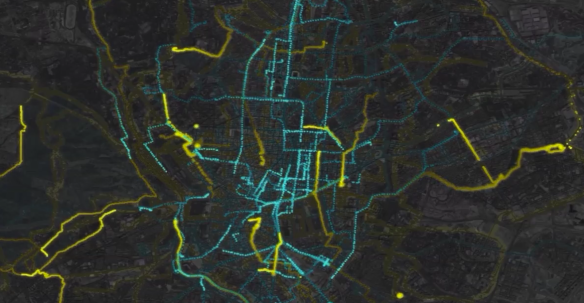
CASA staff and students were on hand for the Painting Connections exhibition this weekend as part of the Hackney WickED festival. The Painting Connections exhibition was a pop-up event at Things Fashions, and ran over Hackney WickED weekend, featuring new work from illustrator Natalie Ryde, photographer Ansell Cizic, and installation artist Marie Brenneis, as well as a performance by legendary Hackney Wick band Fear of Fluffing. Hackney WickED features open studio and arts events, showcasing the creative talent of the area, and we were thrilled to be part of the weekend, and to work with such talented artists. Enormous thanks to all involved.
Painting Connections is a research project exploring sharing among artists in Hackney Wick and Fish Island (HWFI), led by CASA, the IGP, the Bartlett Faculty, and the ISR, with Creative Wick and Affordable Wick, and supported by UCL’s Grand Challenges Sustainable Cities small grants scheme, and UCL PACE in partnership with the Forum for Future London.

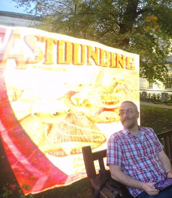 What do the worlds of data visualisation, light painting and the temperance movement have in common? Find out at our Pixelstick-augmented